Overview

Airbnb is a global hospitality platform with a dedicated community space supporting hosts through knowledge sharing and peer connection.

The community platform was originally designed for a single host type. As it expanded to support multiple host types, additional community spaces were introduced while existing spaces required clearer organisation and simplification. The underlying structure was not designed for this level of expansion, which reduced clarity and made it harder for hosts to locate relevant discussions and resources.

This project focused on restructuring the community experience to support multiple host types. I contributed high-fidelity UX designs that simplified the homepage, introduced a new global left-hand navigation for community spaces, and streamlined the header navigation.

The redesigned structure improved content discoverability and established a scalable foundation for future host types. The approved designs were implemented on the live platform.

Client
Airbnb
Role
UX Designer (Supporting role)
Focus
Information Architecture, Navigation Design, UX Simplification
Platform
Web - Community Platform
Tools
Adobe XD
View live platform

Challenge

As the community expanded to support multiple host types, its structure and navigation became increasingly complex. Both the organisation of community spaces and the header navigation required simplification and restructuring.
Previous homepage design showing community spaces presented as homepage tiles, with brand and account links distributed across multiple header menus.

Structural expansion of community spaces

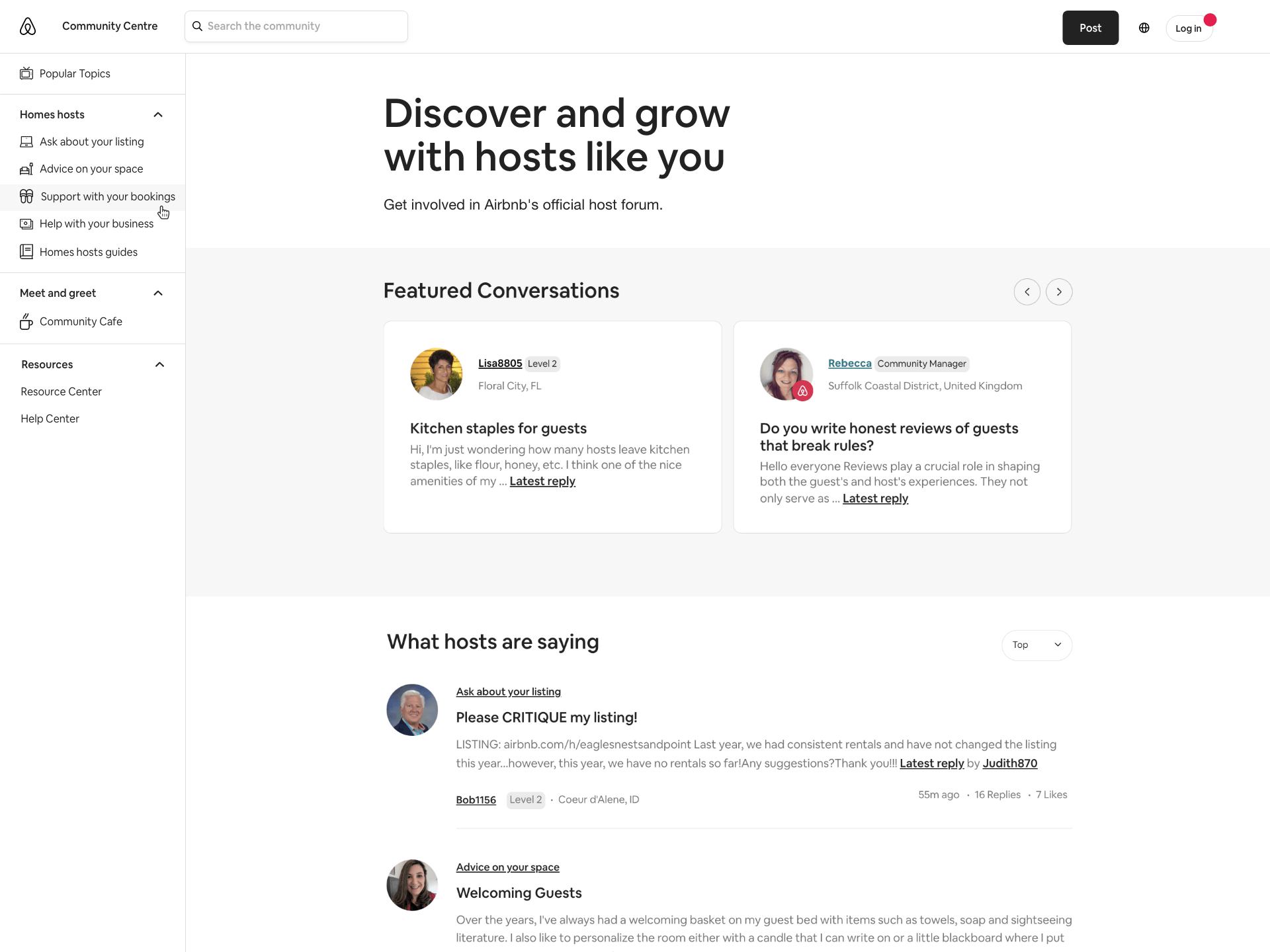
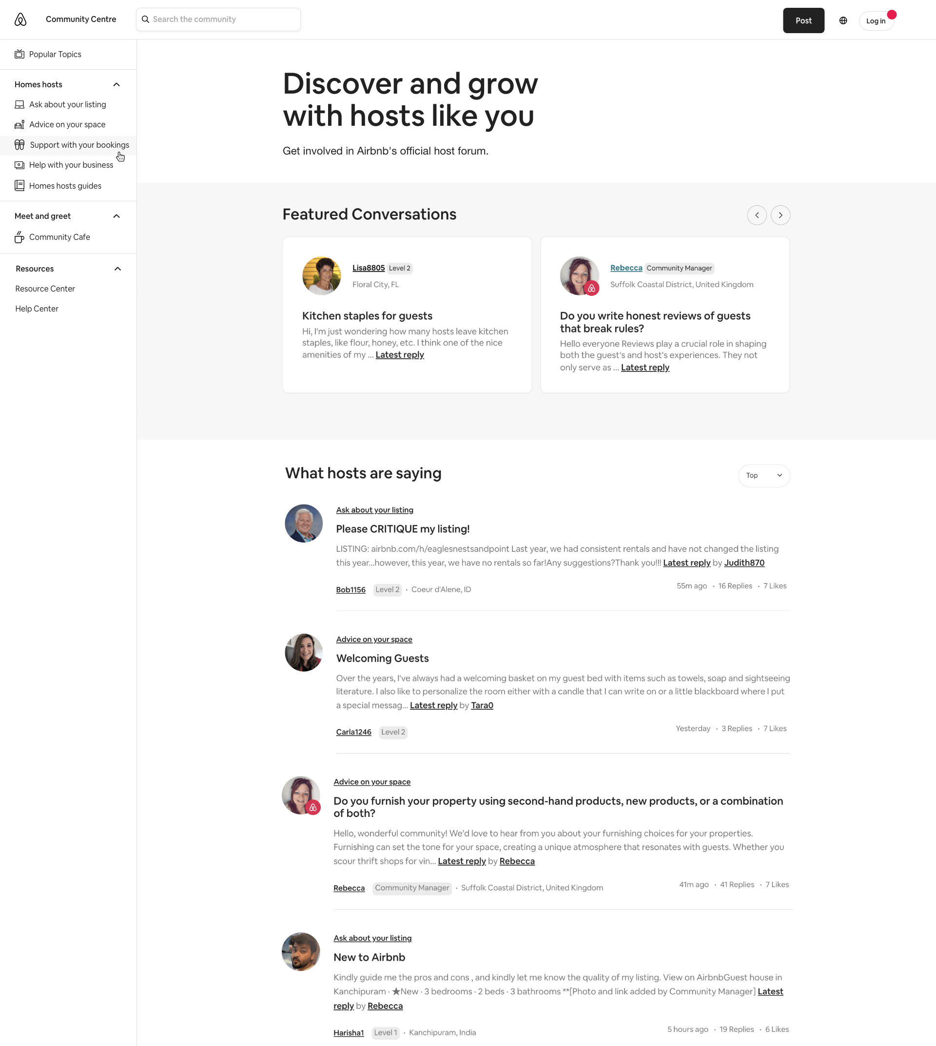
The community navigation was originally structured around a single host type, with dedicated spaces presented on the homepage as tiles. As additional host types were introduced, new spaces needed to be added and existing spaces required clearer organisation. The underlying structure was not designed for this level of expansion.

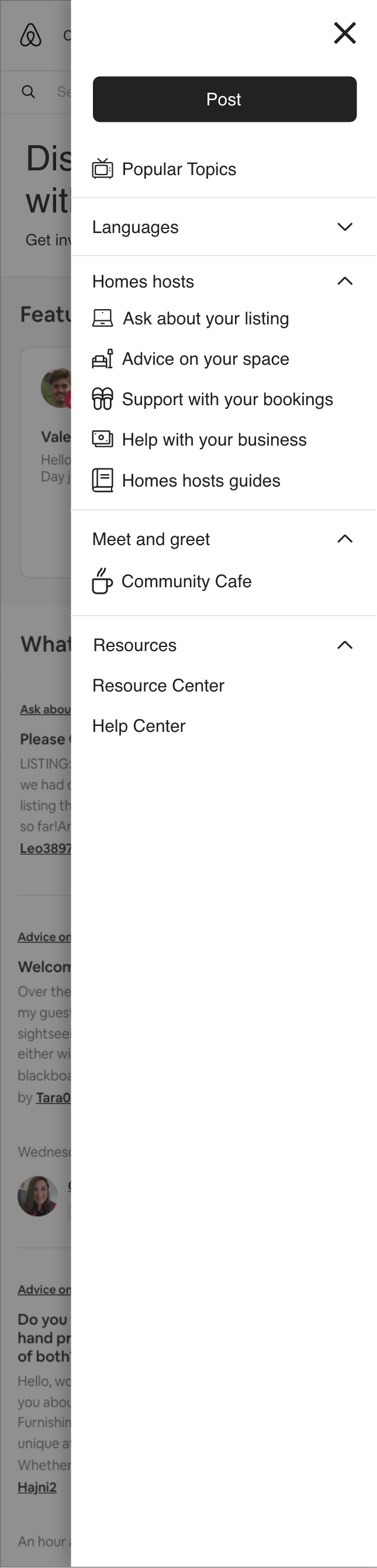
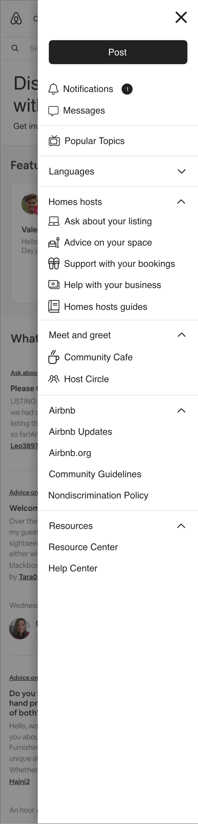
Header navigation complexity
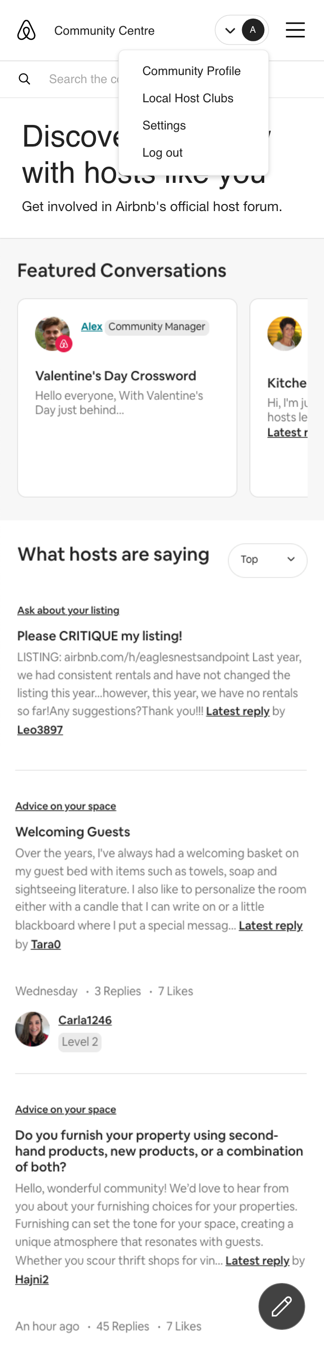
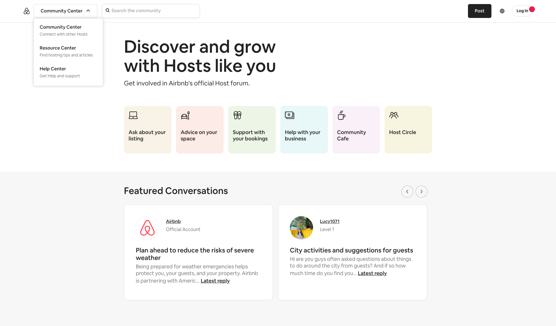
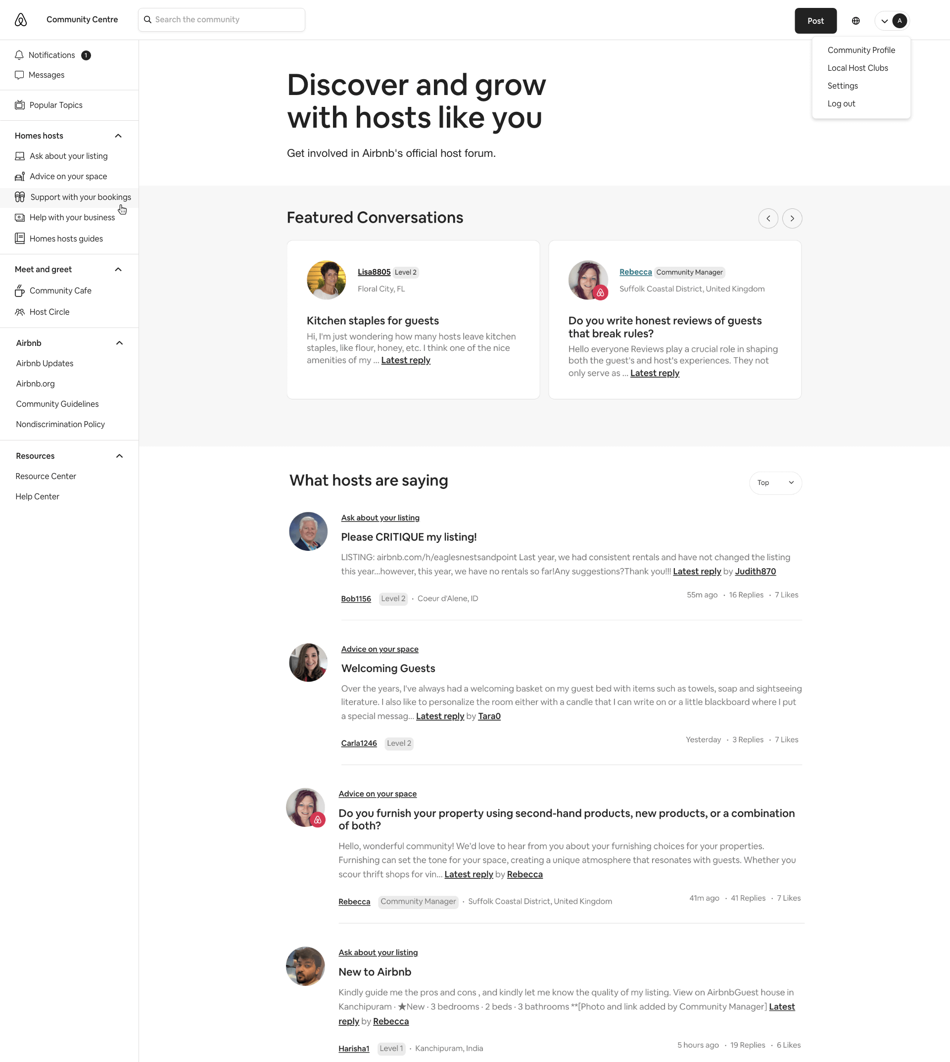
Separately, the header navigation was distributed across multiple menus, serving brand links and account features. Over time, this structure became increasingly complex and required simplification.

Overall impact

Together, these structural and navigational issues reduced clarity across the experience and made it harder for hosts to locate relevant discussions and resources.

Approach

Structuring community spaces

To support multiple host types, the community was reorganised into a more scalable structure. A new global left-hand navigation replaced the homepage tiles in the hero section, providing consistent access to community spaces. The purpose of each space was defined, with a clear separation between public and private areas.

Clarifying header and community navigation

The relationship between the header navigation and community navigation was refined. Selected links were relocated from the header into the left-hand navigation, reducing the header to a single account menu. Community spaces and resource links were grouped and ordered within the left-hand navigation to create a more predictable navigation experience.

Simplification and focus

Unnecessary elements were removed to improve orientation and make the content structure easier to understand. Community spaces and associated content were prioritised by host type and login state to maintain a focused experience.

Working within platform constraints

Changes needed to respect established usage patterns from the primary host group while working within the capabilities of the existing platform and design system.

Solution

The following screens show the updated community experience, highlighting the redesigned navigation and simplified structure introduced to support multiple host types.

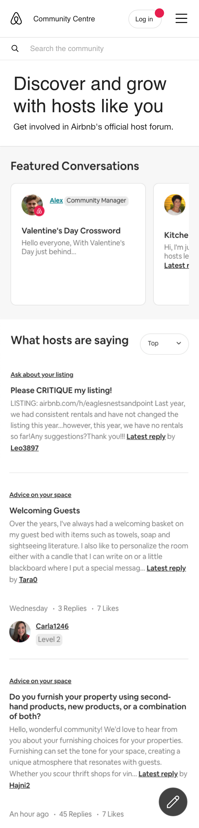
Homepage (Logged out)

The logged-out homepage showing the simplified header with user login, hero section, and global left-hand navigation with public community spaces.

Homepage (Logged in)

The logged-in homepage shows the header user menu, simplified hero section and the global left-hand navigation with public and personalised community spaces.

Global left navigation
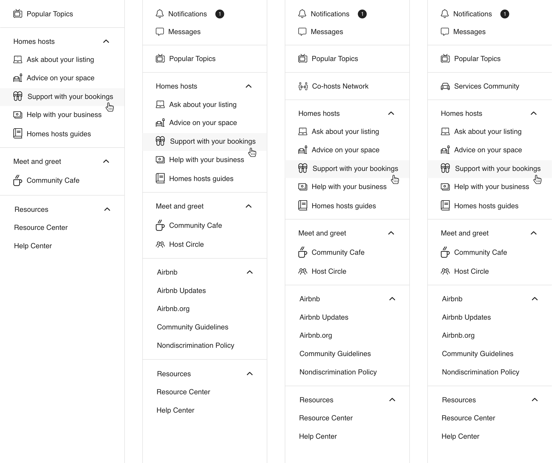
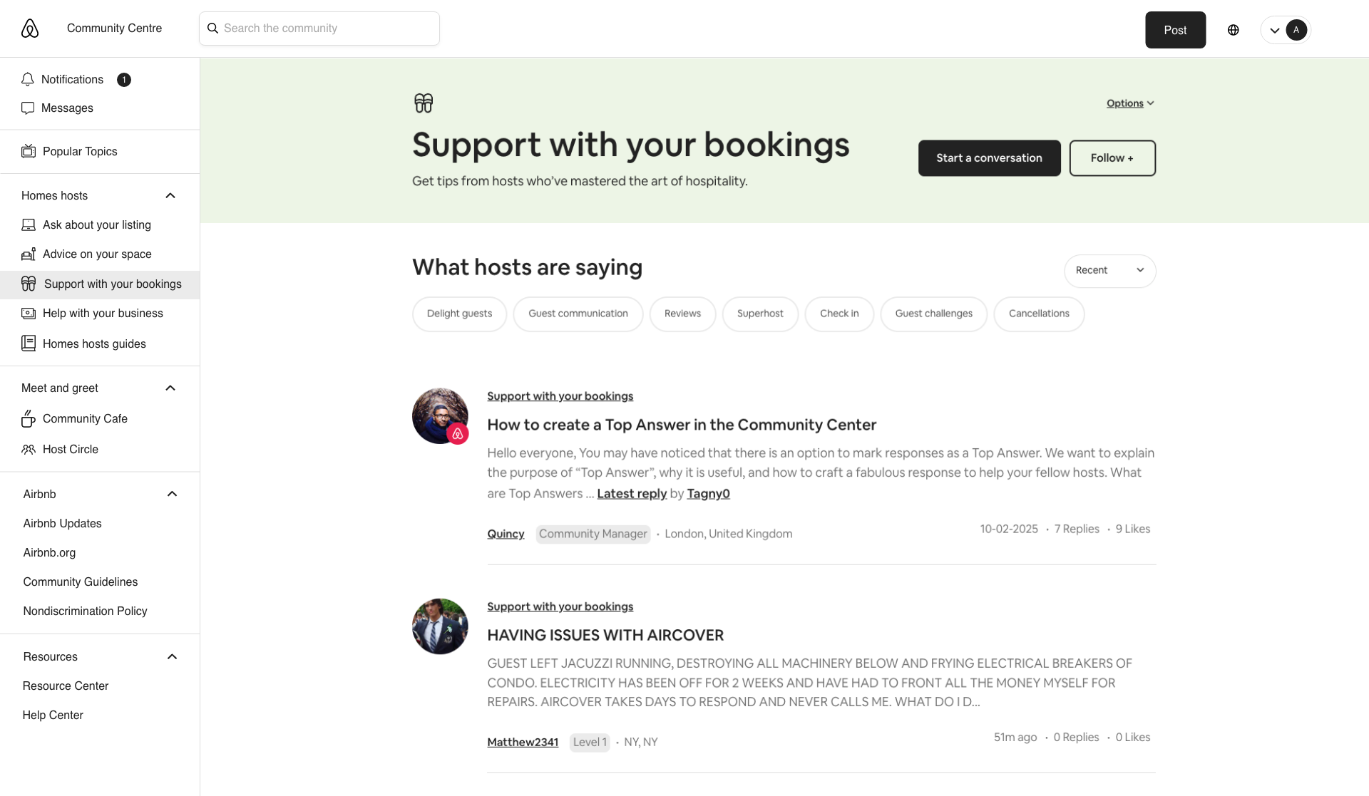
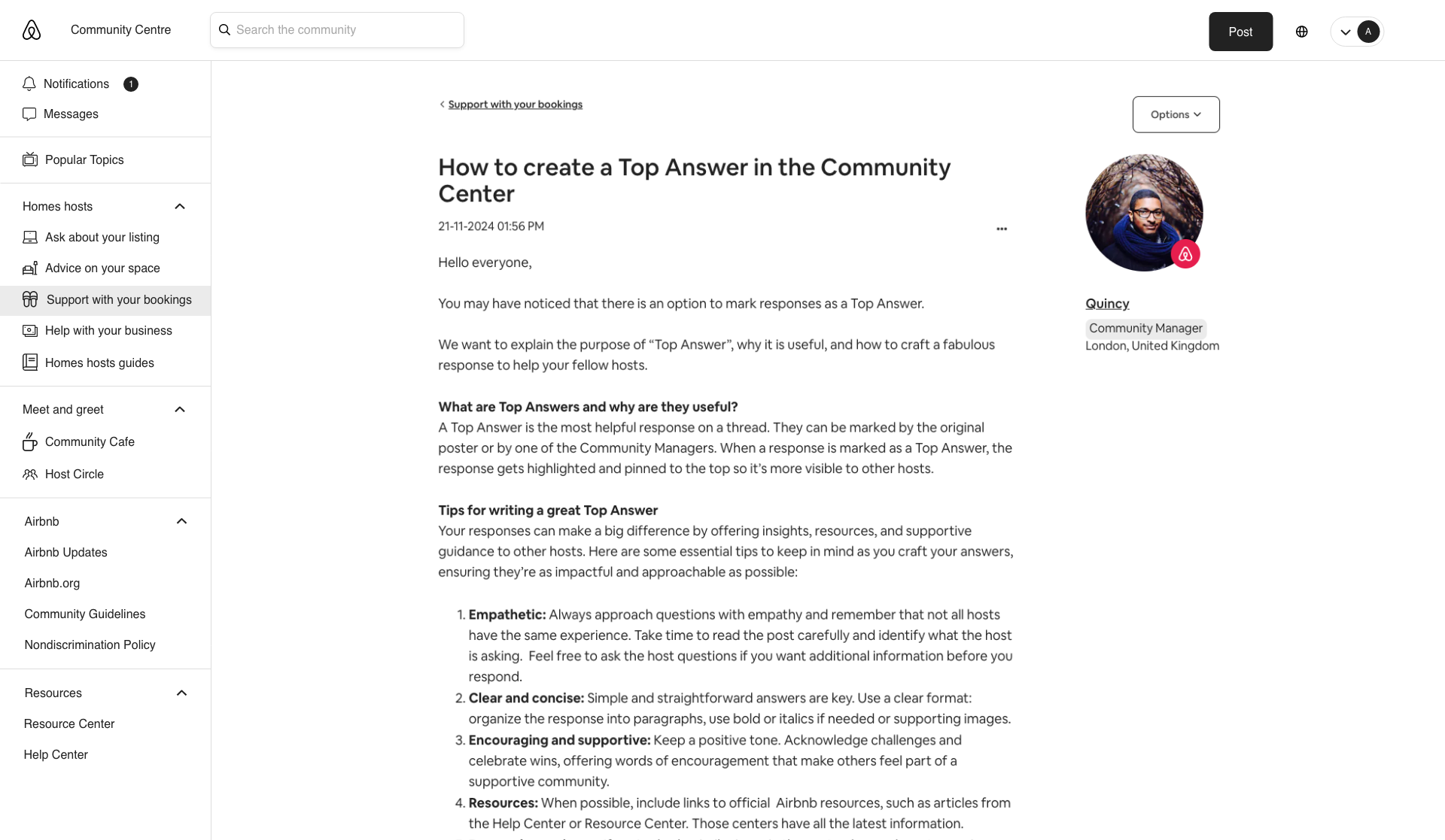
The global left-hand navigation shown across different user types, including logged-out users, homes hosts, co-hosts, and service hosts.

Community spaces

The board and thread views, with the active community space highlighted in the global left-hand navigation to maintain orientation within conversations.


Mobile views

The mobile views of the logged-out and logged-in homepage, highlighting the responsive global navigation and menu states.


Contributions

Roles & focus

I contributed as a supporting UX designer, working alongside the core UX team on the redesign of the community navigation and structure. My focus was exploring a scalable navigation model for community spaces, alongside simplifying the header navigation.

Collaboration

Worked closely with UX designers, engineers, project managers, and community leads through collaborative discussions to align design decisions across disciplines.

Design execution

Produced high-fidelity mockups in Adobe XD for key pages and user states, supporting multiple host types across desktop and mobile.

Outcome

Implemented on the live platform

The new global left-hand navigation and simplified header navigation were implemented on the live platform, replacing the homepage tile model and multi-menu header. The updated structure improved content discoverability and established a scalable foundation for future host types.

Collaborative outcome

Navigation proposals were reviewed across the UX team, with my mockups contributing to the agreed direction. The implemented solution combined selected elements from multiple concepts to form the final navigation structure.
View live platform